The World Sized
by Population
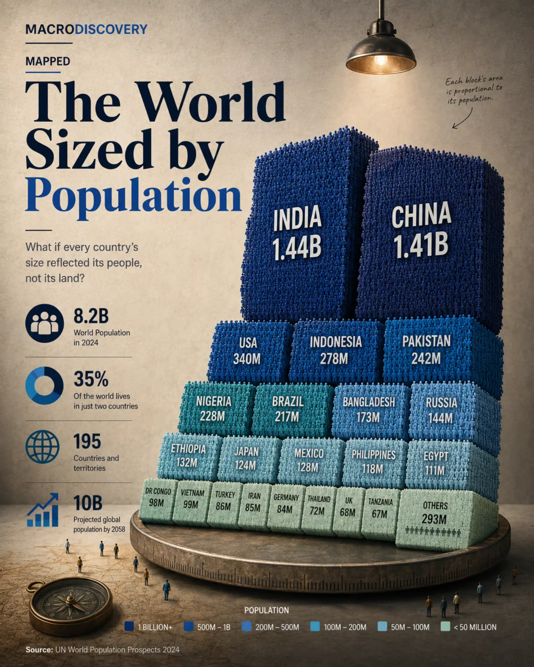
What if every country's size reflected its people, not its land? Canada shrinks to a sliver. Bangladesh balloons. India and China together swallow half the map. Geography lied to us all along.
Each country's area is proportional to its population. Darker blue = more people.
As a share of 8.2 billion. Source: UN World Population Prospects 2024.
What your atlas shows vs what the population data says. The mismatch is larger than most people realize.
Every atlas ever printed has misled you. The map hanging on your wall shows Russia as a continent-spanning giant, Canada as one of the world's dominant land masses, and Australia as a vast territorial presence. What the map does not show you is where the people are.
When you resize every country by its population instead of its land area, the world rearranges itself into something almost unrecognizable. Asia expands until it swallows most of the map. Africa grows substantially. Europe shrinks. And the English-speaking world — which dominates so much of geopolitics and media — turns out to be a relatively modest share of humanity.
"India and China together hold 2.85 billion people. That is more than the entire population of the world in 1950 — compressed into two countries."
The Two Giants
The Geography Illusion
The most dramatic distortion in the standard world map is Russia. It occupies 11% of Earth's total land surface — larger than the entire continent of South America. On a population map, it shrinks to roughly the size of Bangladesh, which covers less than 0.1% of global land area but holds nearly the same number of people.
Canada, the world's second-largest country by area, holds just 38 million people — fewer than the state of California. Australia, an entire continent, has 26 million. These are not small countries by any conventional measure. On a population map, they are barely visible.
The inverse is equally striking. Bangladesh is one of the most densely populated places on Earth — 1,200 people per square kilometer versus Canada's 4. Taiwan, an island most world maps render as a footnote off the Chinese coast, holds 23 million people at extraordinary density. The Netherlands, often overlooked in European coverage, has more people per square kilometer than India.
The population map does not just look different from the atlas. It changes how you should think about economic weight, democratic representation, market size, and the distribution of future influence.
The world's economic and political architecture — permanent UN Security Council seats, G7 membership, most major international institutions — was designed in an era when Europe and North America represented a much larger share of humanity. By 2050, Asia and Africa together will hold approximately 77% of the world's population. The map drawn by land will continue to look the same. The map drawn by people will have changed completely.
Geography is a fact. But it is not the same fact as demography.